How to Choose Interior Paint Colors That Work with Pittsburgh’s Natural Light
Pittsburgh homes live under shifting skies. From bright summer evenings to long gray winters, light changes fast here, and that light changes your walls. If you want interior paint colors that look right every day, start by thinking about where the light comes from, how often it is overcast, and what is outside your windows. When you work with Markantone Painting, our team uses these local light patterns to guide color choices so your rooms feel calm, warm, and consistent.
Color works best when it is paired with a clean, professional finish. That is why homeowners across Shadyside, Squirrel Hill, Lawrenceville, and the South Hills rely on our interior painting service to match shade, sheen, and surface prep to each space. In this guide, we explain how Pittsburgh light behaves and how pros use it to your advantage, without asking you to do the work yourself.
Why Pittsburgh Light Changes How Colors Look
Our city sits in a valley with rivers, bridges, and hills that bounce and filter light. Cloud cover is common in late fall, winter, and early spring, which creates softer, bluer daylight. In summer, late-day sun can pour in from the west and make colors look warmer and more saturated. Trees add to it. Leafy streets in Highland Park or Regent Square cast green reflections, while open views on Mount Washington or the North Shore let more sky color in.
Because of all this, paint chips from the store can be misleading. The same greige that looks balanced at noon in the showroom may read taupe at dusk in your living room. The goal is not to chase a single perfect swatch. It is to choose a family of tones and a finish that stay pleasant as the light shifts. A trained painter understands this dance between pigment and light and plans for it.
How To Choose Interior Paint Colors in Pittsburgh Homes
Every room tells a light story. Your painter will look at window direction, the size of the openings, and what is outside. Here is how orientation typically plays out in Allegheny County homes:
- north-facing rooms often read cooler than you expect. Soft whites, balanced greiges, and muted warm tones help add quiet warmth without turning yellow.
- south-facing rooms receive steadier light that can warm up color. Off-whites and cool neutrals prevent a space from feeling too bright at midday.
- east-facing rooms get crisp morning sun that fades by afternoon. Pale blues, fresh greens, and delicate creams feel lively at breakfast and calm later.
- west-facing rooms glow in the evening. Dusty blues, gentle taupes, and complex neutrals keep sunset light from pushing colors too orange.
Local surroundings matter too. Brick, slate, and dark trim, common in older Pittsburgh homes, can cast color into a room. Large oaks or maples can add green shadows in summer, then remove that filter in winter. A pro reads these cues before recommending a palette.
Undertones And Finishes That Stay True Year-Round
Two colors that look identical on a strip can behave very differently on your wall, because every paint has undertones. Your painter will select hues with stable undertones that resist big swings between seasons. Finish also matters, since sheen levels reflect light in different ways.
- Warm greiges with a touch of red or yellow undertone add comfort in cloudy months without turning orange in summer.
- Balanced off-whites with a hint of gray avoid the stark, blue cast that pure whites can show under overcast skies.
- Complex blues and blue-grays with muted green undertones stay calm at sunset and do not feel icy in winter.
- finish choice affects both color and durability. Eggshell softens wall texture and controls glare in bright rooms. Satin adds wipe-ability for busy spaces like kitchens and baths. Flat hides small flaws in older plaster found in many city homes.
Pros look at how your lighting mix interacts with paint. Recessed LEDs with high color rendering, warm-glow lamps, and daylight bulbs each tug on undertones differently. Your painter will balance artificial light with the room’s natural light so the color you love in the afternoon still looks right after dinner.
Room-By-Room Color Ideas For Pittsburgh Lifestyles
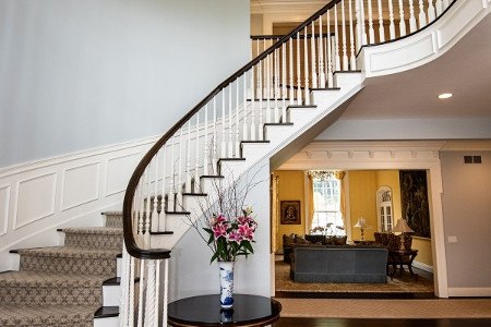
In Lawrenceville lofts with tall windows, muted whites and soft grays let brick, metal, and artwork stand out without feeling cold. In Mt. Lebanon colonials with tree-lined streets, warm neutrals and blue-grays bring balance to leafy views in summer and open skies in winter. For South Side rowhomes where rooms run long and narrow, a connected palette of two or three related tones can make the space feel unified.
Bedrooms in Squirrel Hill often benefit from quieter mid-tones that look restful under both morning and evening light. Dining rooms facing west can carry a deeper neutral that glows at sunset but stays composed when lit by pendants. Your painter will consider how each room is used, how it connects to adjacent spaces, and how the home flows from entry to living areas.
How Pros Test Color In Real Pittsburgh Light
A professional brings the color conversation into your home. Instead of guessing from tiny chips, we review larger swatches and the surrounding finishes, then evaluate in your actual rooms at different times of day. We track how the shade responds to cloud cover and direct sun, and how it plays with floors, cabinets, tile, and trim.
overcast winter skies can flatten bright whites. That is why your painter may steer you toward balanced off-whites or nuanced neutrals that still look crisp when the sun hides. In a bright south-facing kitchen, the same pros might suggest a cooler white to counter strong midday warmth. It is a careful, room-by-room decision.
When sheen is chosen, the pro will align it with how you live. Busy family rooms might lean satin for easy cleaning. Quiet studies or media rooms often prefer flatter finishes to cut reflections. Doors, wainscoting, and trim can move up a sheen level for a subtle contrast that frames the walls and sharpens the architecture.
Neighborhood Nuances Across The City
Older homes in Shadyside and Point Breeze often feature detailed trim and plaster that reward soft, layered palettes. Here, gentle contrasts between wall and trim make rooms feel tailored without harsh lines. In the Strip District, open-plan condos can handle a touch more depth because late-day sun from west-facing windows warms the space. East-facing bedrooms in Bellevue or Edgewood may prefer quiet mid-tones that feel fresh at breakfast and calm by afternoon.
On hillsides like Mount Washington and Beechview, wide sky views make daylight cooler and brighter. Colors with mild warmth stay inviting under that extra blue in the light. Near wooded lots in Fox Chapel or O’Hara, greens outside can bounce into rooms, so your painter might recommend neutrals that resist picking up too much of that cast. Across the South Hills, where rooms often connect in a circular flow, a cohesive three-color scheme keeps transitions smooth.
Trim, Ceilings, And Doors: The Quiet Framework
Wall color does a lot of work, but trim and doors frame the scene. Slightly warmer whites on trim can prevent a room from feeling sterile during long gray stretches, while cooler ceilings can lift a space that runs warm in summer. In homes with natural wood trim, balanced wall colors let oak or walnut glow without turning the room orange. Your painter will also align door and cabinet finishes so hardware, counters, and floors all feel like they belong together.
Designing A Whole-Home Palette That Flows
A house feels calm when colors change with intention. Professionals build palettes that shift subtly between rooms, guided by light and function. A warm greige in the living room might step one shade lighter in the hallway and then pair with a soft blue-gray in the bedroom. This gentle movement keeps energy without visual whiplash. It is especially helpful in classic Pittsburgh layouts where narrow halls open into brighter front rooms.
For inspiration on how light and color work together, explore our painting tips blog, then bring your favorites to a color consultation. We will align those ideas with your natural light, finishes, and the way you use each space, so the end result feels personal and steady all year.
Color And Light Pitfalls To Avoid
Some choices sound great on paper but falter in our climate. Ultra-cool grays can feel chilly in north-facing rooms during winter. High-gloss on large wall areas shows every ripple, common in older plaster. Stark, blue-leaning whites can seem sterile when snow is on the ground and skies are pale.
ask your painter to sample colors across different times of day so you can see how morning, midday, and evening change the look. A pro will also compare options against your fixed finishes. Countertops, tile, and floors often decide the final direction more than any chip on a rack.
Bringing It All Together With Professional Interior Painting
Choosing color in Pittsburgh is not guesswork. It is a thoughtful process that blends orientation, season, sheen, and surroundings. Our team manages all of it, from preparing surfaces to applying the exact product and finish that fit your rooms. If you want a space that looks right in January and July, talk with us about interior painting in pittsburgh and see how a pro plan keeps your colors true.
For homeowners who like to study options, you can also review examples of interior paint colors in Pittsburgh, PA and see how balance, undertone, and finish play out across real projects. Then bring your notes to a consultation. We will translate them into a cohesive palette that fits your home and your light.
Ready For Colors That Feel Right Every Day?
If your walls look dull on cloudy days or too bright at sunset, you are not alone. Pittsburgh light is unique, and your home deserves a palette built for it. Schedule a color-focused walkthrough with Markantone Painting and our professional interior painting team. We will plan orientation by orientation, select stable undertones, and match finishes to how you live.
Call 412-825-8001 to get started. We will help you choose colors that are calm on gray mornings, lively on sunny afternoons, and welcoming every evening of the year.
Want to Revitalize Your Space? Get in Touch with our Painting Company in Pittsburgh Today!